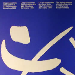
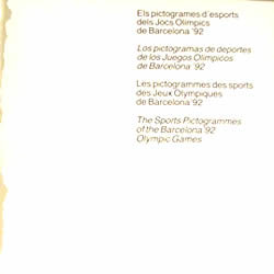
Olympic Games’ pictograms
The set of pictograms used for the Barcelona’92 Olympic Games represented a qualitative evolution when compared to those that had been used in earlier Olympic Games, which had followed the style originating from Munich’72 created by the designer Otl Aicher. In Barcelona’s case, the basis for the pictograms was the logo created by Josep Maria Trias, which represented a substantial change in comparison to earlier pictograms because the style was based on a drawing of the human body that had only three differentiated parts: head, arms and legs.
A total of 32 pictograms were created, of which 25 represented official sports, three represented demonstration sports (Barcelona was the last host city where demonstrations were held), three represented aquatic sports that were not races (water polo, diving and synchronised swimming) and one represented the whitewater slalom. In addition, 82 new figures were designed for pictograms representing the services, recreational areas and facility surroundings, as were four symbols that adapted transport signs already in existence in the city. The pictograms were generally reproduced in white on a blue background.
Paralympic Games’ pictograms
Paralympic sports pictograms followed the same structure of the olympic sports pictograms to give similarities to both and to reinforce the idea that, together, formed the project of Barcelona ’92. Thus, they repeated the anthropomorphic character of the symbols using, in this case, the representation of the wheelchair instead of legs as a way of representing the handicaps.
It was possible to identify the Paralympic Games with the common project of Barcelona ’92 and yet give it a unique and distiguishing character stimulating the idea of movement and ability and that sport is accessible to everyone. The pictograms for the exclusively paralympic sports , boccia and goalball, were designed according to the resources used for the rest of the pictograms.